Going beyond NPS - Using word frequencies in user surveys to uncover insight.
Frequently used, thoroughly researched, but also sometimes criticized metric for quantifying customer loyalty and user satisfaction is the well known Net Promoter Score or NPS. The basic idea of NPS is to ask just one simple question along the lines of “How likely would you be to recommend us to a friend or colleague?”. Traditionally the question can be answered on an 11-point Likert scale, ranging from 0 (not at all likely) to 10 (extremely likely), where those who gave a 9 or a 10 are called promoters, between 7 and 8 are passives, and everyone below and including 6 are called detractors. A Net Promoter Score is then achieved by selecting a time window – a week, a month, a quarter, a year – tallying up the promoters, from that removing the number of detractors, and dividing the result by the total number of respondents. It’s essentially a difference between the percentage of promoters and the percentage of detractors. In the Topia user survey we also ask the NPS question.
While it is up for debate whether NPS is the metric to base your future decisions upon, its use is nevertheless widespread. It has been employed by a large number of companies and it is claimed to be correlated with revenue growth. The truth probably lies somewhere in between. But one thing that is harder to argue against is that the real gold lies in the free form textual follow-up questions in the survey. These provide the underlying reasons behind the NPS number, reflecting the voice of a customer, and that’s exactly what we are going to focus on in this post.
So let’s look at some of the methods we can use to study the free form textual answers from our survey responses in 2017. As an example we are only going to focus on one specific question – the reason behind our main NPS question “Please tell us why you rated your experience that way”.
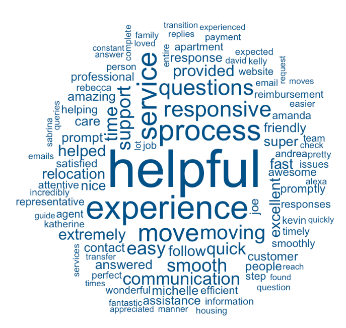
 A popular way of presenting the frequencies of words is a word cloud. Word clouds have just one great property – that they can fit lots of word compactly in a small space. Interpreting the result or extracting some kind of narrative out from the jumble of words is much harder. The figure above shows the most commonly used words that the promoters used for explaining their high overall experience rating. So we can read out that promoters found someone or something helpful (presumably us), something to do with experience, move, service, process, something is responsive (presumably the responses to their troubles) and something about questions. One must have above average understanding of the context in order to really make sense of a word cloud.
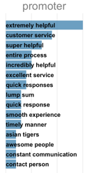
To get more context we can go one step higher and look at bigrams – pairs of consecutive words. And to make the relative frequencies more easily comparable we can look at bar charts instead of word clouds.

The adjacent bar charts shows the most frequently used bigrams (pair of consecutive words). Bar charts convey the information about relative frequencies and by looking at two consecutive words we already get so much more context.
The reasons the promoters liked their experience were extremely-super-incredibly helpful, customer service, excellent service and quick to respond.
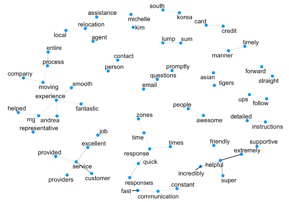
With bigrams we’re starting to get the full picture, but something is still missing. Let’s separate each bigram back into two individual words. What if for each pair we put the two words on a figure and join them with a line that is as thick as the frequency of that pair? Suddenly a graph emerges that can convey even more context, keeping the relative frequencies mostly interpretable. Such a graph for the promoter group looks like the following.

The frequencies of the connections are quite small so almost all of them look identical. But now we can read out ideas that make even more sense customer-service-provided-excellent-job, time-zones-response-time-quick-fast-communication, and moving-experience-entire-process-smooth-fantastic. It’s a simple method that can deliver a significantly more readable digest of a large chunk of text.
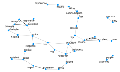
The two graphs we just saw were constructed from words that appeared consecutively within the text. But maybe some words tend to frequently appear together in the same sentence that are not necessarily directly next to each other? Let’s look at pairwise correlations of words and find the pairs with the highest correlation. We can put those on the graph in a similar way as in the previous figures, except now we draw a line between two words when their correlation value is above a certain threshold.

Lengthy chains of words and concepts appear that can potentially deliver even more insight into the reasons behind the given ratings. For promoters we can read out concepts like moving-experience-communication-fast, excellent-care-customer-service, responsive-answered-questions-promptly, process-easy and awesome-people.
And while it’s always great to spend time looking at the items you’re getting right, it’s equally important to spend time looking at the potential areas for improvement – through examining the word frequency of detractors. Last year, NPS detractors seemed to be talking about payment-system-expense-reimbursement-slow and problems with bank-account-fee-transfer-pay. Through this analysis we were able to identify our reimbursement process as a pain point for relocating employees. As a result we revamped our payment operations and now deliver reimbursements and payments well under the industry standard without any associated fees born by the employee.
So we see that on top of word clouds there are many superior ways of studying the patterns in the free form text. With relatively simple methods we are able to identify complex ideas and extract insight about what’s behind the overall experience ratings. The correlation graphs we looked at were done at a sentence level, but they could just as easily be done at an answer level to perhaps reveal even more secrets. As the English vocabulary has quite a few words in it and as there are lots of different ways to talk about the same concept, such simple methods might fall short for more complex ideas and nuanced manners of speech. In such cases more powerful language models need to be employed. A complex model means lots of parameters and lots of parameters asks for big data.


